
Low Tide Versus High Tide
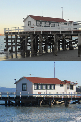
These images show low tide and high tide on January 19, 2011 near the Golden Gate NOAA tide gauge in the San Francisco Bay.
The question is, is this normal or is there cause for concern?
Data from the tide gauge for this time frame is available from the NOAA’s tides and currents website.
The data can be downloaded via a csv file and manipulated in Excel or some other spreadsheet program. The web application also generates an interactive graph of the data.
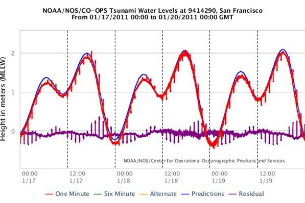
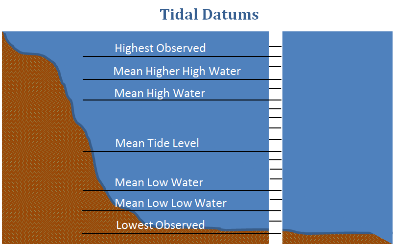
To understand the vertical axis you must understand tidal datums. The MLLW stands for mean low low water.
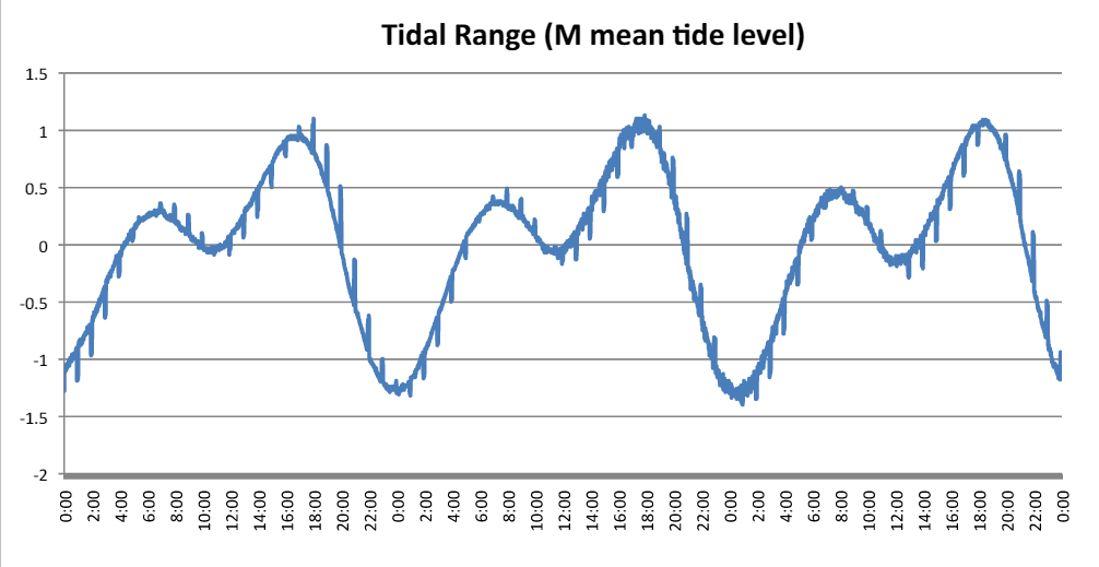
If we adjust the graph to center around the mean tide level, it looks like this.
Questions to Investigate
The graph is sinusoidal in nature. Is there an absolute value function here? What would its equation be? What would its normal range be?
Was this an abnormal three days for sea level or would three different days have consistent levels?
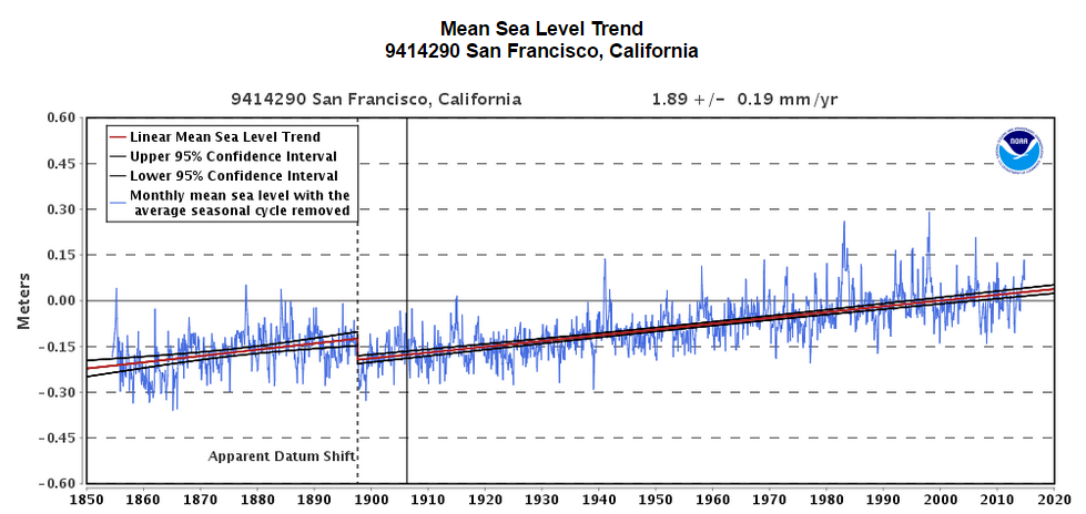
Would plotting the tide’s ebbing and flowing over time potentially show us a rising sea level?
Could a line of best fit be generated and used to predict when certain structures will be in jeopardy of flooding? Could insurance companies use this data to adjust their flood plain maps?
9414290_MeanSeaLevelTrends.csv
Why are the sinusoidal graphs “droopy”?
It’s apparent the sea level around San Francisco is rising, but is it an isolated event? Is San Francisco sinking or is this a global concern? How could you find out?
A special thanks to guest contributor Kristy Milliken, PHD.

Leave A Comment