
The article titled Slope described real-world situations in which the concept of slope is useful. Graphing Slope is the next step. Moving the concept to graph paper or a graphing application. Slope Y-Intercept introduced the concept of the slope y-intercept form of a linear equation. This article will describe how to take data from a table and find an equation of a line that fits the data.
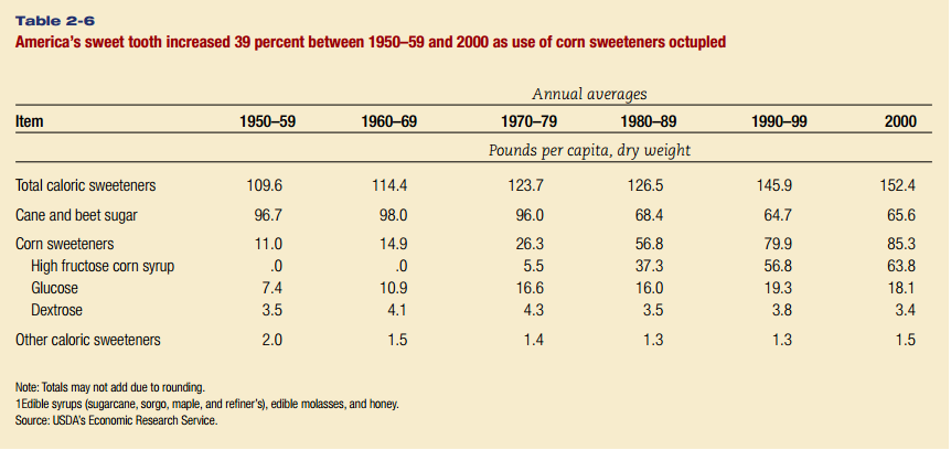
The American Appetite for Sugar makes a case for exploring data to make your own conclusions about sweetener consumption over time. Let’s use an online graphing calculator to plot the total sweetener consumption in the table below.
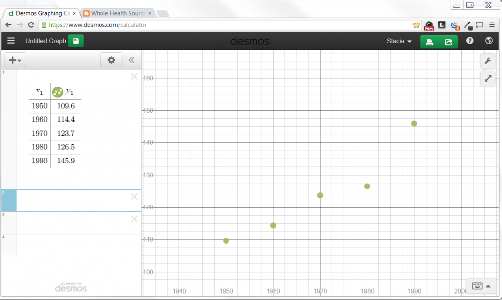
Go to Desmos Graphing Calculator. Click on the tool icon in the upper right to change the x-values to include 1940 to 2000 with a step of 10. Change the y-values to include 100 to 160 with a step of 10.
Click on the + icon to add a table. Type the decades in the x column and the pounds of sweetener in the y column for each decade.
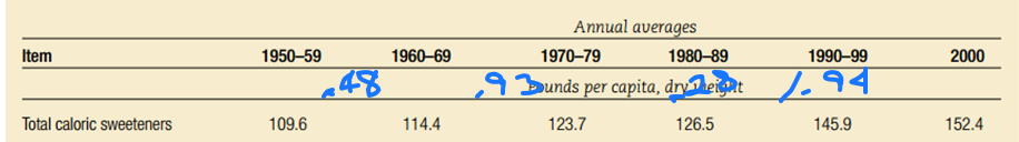
Now go back to your data to determine what a reasonable slope would be for the line. Calculate the slope of each pair of points.
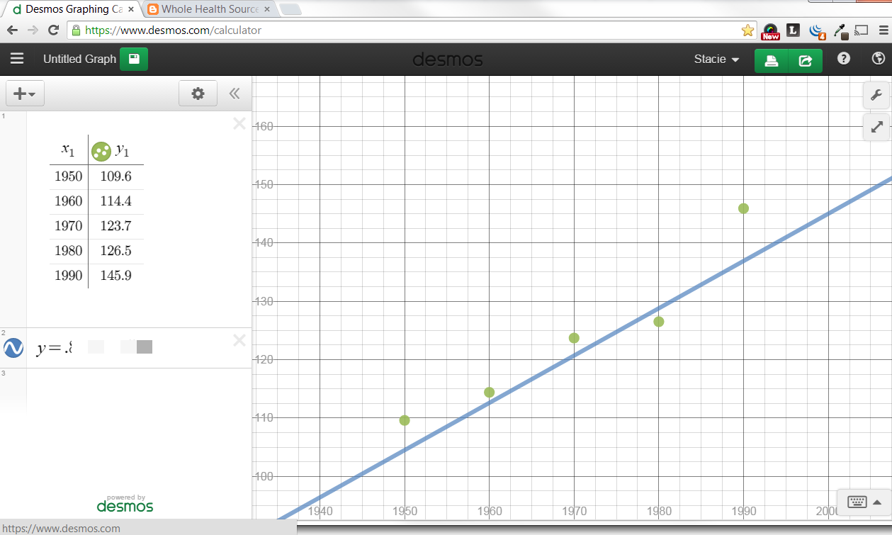
Within the online calculator, click the + sign to add an f(x) expression. Type y= your slope x + your intercept. then adjust by changing the slope and y-intercept until the line fits the points.
Now go back and graph the data on high fructose corn syrup. Or download one of the tables at the USDA Economic Research Service like Table 50—U.S. per capita caloric sweeteners estimated deliveries for domestic food and beverage use, by calendar year and graph each year instead of the average of each decade. Make predictions write equations and learn about the statistics that are readily available.
Most of all, you are empowered to make informed choices about what you put in your body.
