
Stacie Bender 9/23/14
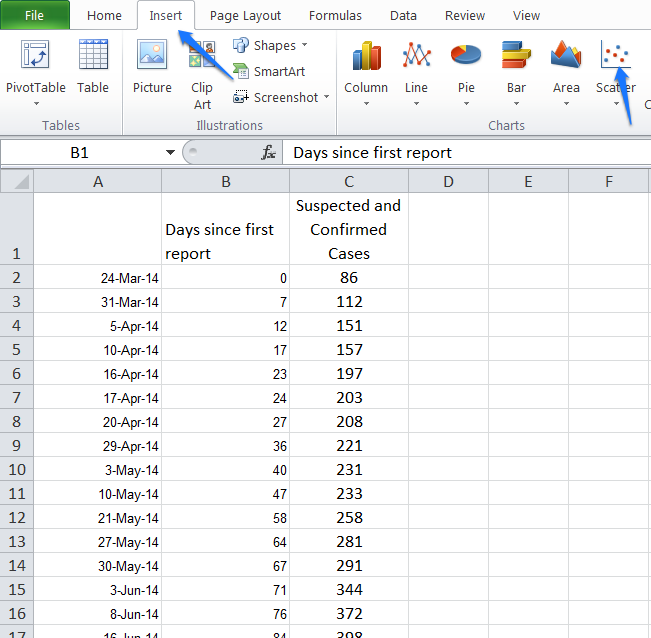
To show how students with an understanding of exponents and logarithms can make sense real world math, let’s look at the current Ebola outbreak. According to the CDC’s website, as of September 19, 2014, a total of 5,864 cases were either suspected or confirmed. Begin by plotting the previous outbreak updates in Excel. Each update shows the number of suspected or confirmed cases. Plot the date and the number of cases or download the spreadsheet provided. EbolaOutbreak2014
Add a column for calculation of the number of days since the first report. To calculate the number of days, type an = sign, then click on the March 31st value type a minus sign then click on the March 24th value and press enter.
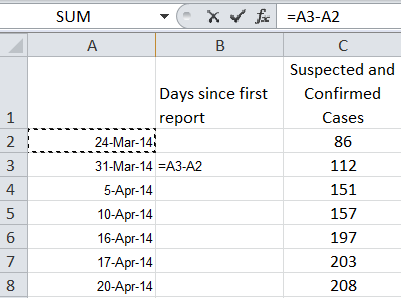
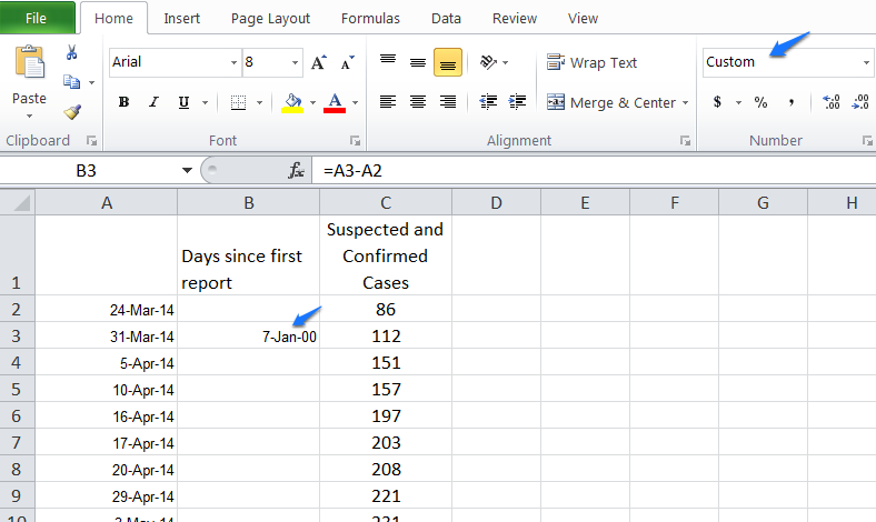
The answer will appear in a date format. Change the Custom format to General.
Modify the formula to be an absolute reference so it always subtracts March 24th from the date, not the adjacent date.
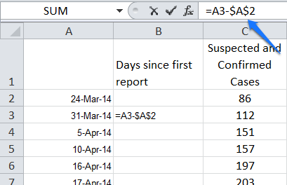
Place a 0 in the cell corresponding to the days since the first report for March 24th and format it as a General number.
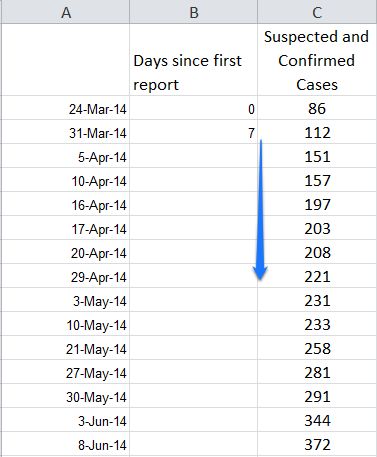
Fill the equation in cell B3 down to the other data points.
Select the values in columns B and C, then click Insert > Scatter > choose a Scatter Plot.
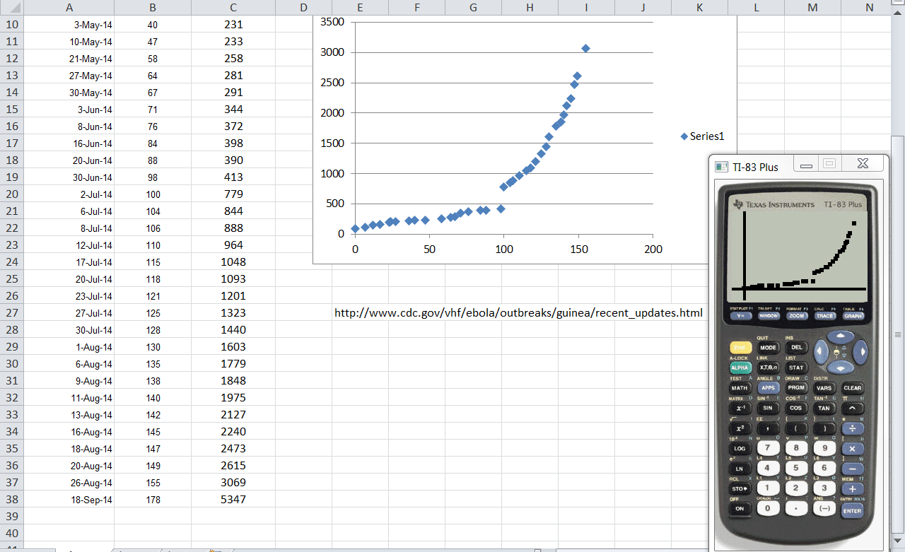
Excel will display a curve that looks like exponential growth.

Take out your graphing calculator. Click on Stat and press enter to edit. In your L1 column, enter the days since the initial report. In the L2 column, enter the number of cases.

When you are finished, if you press the Graph button, it may look like there is no data because the data is larger than the current window. Press Zoom and arrow down to Stat. You’ll see the same scatter plot that was graphed in Excel.
To predict the curve of best fit, press Stat > Calc. arrow down to ExpReg and press Enter. Press Enter again and the calculator will predict the equation of the exponential curve based on the data points.
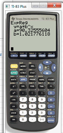
Use the equation to graph the curve and see how well it matches the points. Press the Y= button. Type 88.919 × 1.022 ^ x then press Graph.
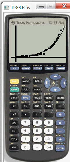
As you can see, the curve matches the data points well. Thus the equation of y = 88.919 * 1.022x can be used to predict the number of cases, y, for day, x.
If you right click on the data points in Excel and choose Add Trendline, you can choose an Exponential regression. Check the Display Equation on chart and the Display R-squared value on chart boxes, then press Close.
Excel will display its curve of best fit and an R squared value. The closer the R square value is to the number one, the better the fit the curve has to the data.
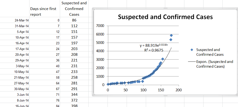
We can also use the equation y = 88.919 e.0218x to predict the likely cases based on time. See Exponential and Logarithmic Models to make predictions using these models. We can also compare our models’ predictions to the CDC’s predictions – Estimating the Future Number of Cases in the Ebola Epidemic—Liberia and Sierra Leone, 2014–2015
See also Ebola 2014 Revisited.